Building a Comprehensive N8n Command Center with Grafana: The Detailed Journey
-
demodomain
- . March 10, 2025
- 3,915 Views
-
Shares
Let’s start with scope – this isn’t about multi-tenant setups. While N8n can be used in multi-tenant environments, that opens up a whole set of challenges around workflow synchronization, security, and resource isolation. Whether you separate tenants using row-level security in a single database or deploy separate containerized instances, each approach has its complexities. That’s a topic that needs its own deep dive and usually requires customized consulting. This post focuses on monitoring a single N8n instance.
The Current State: N8n’s Native Interface
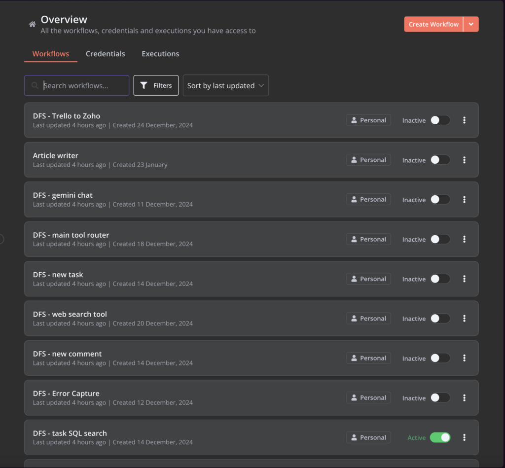
N8n provides two main views of your workflows. The workflow list shows you basic information – workflow name, when it was created, when it was updated, and whether it’s active. That’s it. No execution statistics, no performance metrics, nothing about the actual behavior of your workflows.
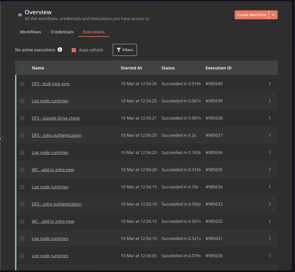
The executions list provides more detail. You can see recent executions with their status, including currently running executions (shown with an animated GIF), and whether each execution succeeded or failed. You can filter by status and view execution details. So far, so good.
But there are significant limitations:
The Workflow List Problem
From the workflow list, you get no summary information – no count of failed versus successful executions, no average execution time. This isn’t just a limitation of the view; this information isn’t available anywhere in N8n’s interface. These metrics should be readily available from the workflow list, with the ability to drill down into execution details when needed.
The Metadata Mess
While N8n allows filtering by “highlighted data” (their term for metadata), it becomes unwieldy at scale. Here’s why: Each workflow can have multiple key-value pairs set through execution data nodes. With 50 workflows, each potentially having multiple metadata entries, you need to remember every possible key and value to use the filter effectively. There’s no dropdown, no suggestions – just a blank text field expecting you to know exactly what to type.
The Empty Execution Problem
Many workflows are set to run frequently – every few seconds – to check for new data to process. This means your execution list gets flooded with executions that technically didn’t do anything. If 90% of your executions are just “checked for data, found nothing, ended,” it becomes difficult to find the meaningful executions that actually processed something.
Why Build a Custom Dashboard?
This wasn’t about solving specific problems – I already have various monitoring systems in place for different aspects of the operation. This was about consolidation – creating a command center where I can see everything happening in my N8n instance, with the potential to integrate metrics from other platforms like Google Analytics or CRM systems.
But before we dive into the solution, there’s a critical operational issue to address: N8n’s behavior during problems.
The Runaway Workflow Challenge
If you have an infinitely repeating workflow or loop nodes that go haywire, your server responsiveness can degrade to the point where you can’t even log in to stop the workflow. Even if you can log in, stopping an execution requires finding it in the list, waiting for it to load (on an already struggling server), and clicking the stop button. You can disable a workflow, but that doesn’t stop existing executions, and doesn’t delete executions waiting on the queue.
This is why external control is crucial, and it influenced some of my dashboard design decisions.
The Grafana Solution: Why Grafana?
I chose Grafana for several reasons. It’s the top-rated open source visualization tool on GitHub, which usually indicates good community support and regular updates. But beyond that, it’s incredibly flexible – you can connect it directly to databases, APIs, and various data sources through plugins. The drag-and-drop interface for panels means I can reorganize my dashboard as my monitoring needs evolve.
Most importantly, it lets me connect directly to N8n’s Postgres database. No middleware, no extra services – just direct database connectivity. Though I should note, this required significant investigation into N8n’s database structure, particularly how they store execution data in rather complex JSON objects with multiple interlinking references. More on that in a follow-up technical post.
Dashboard Components
Workflow Overview
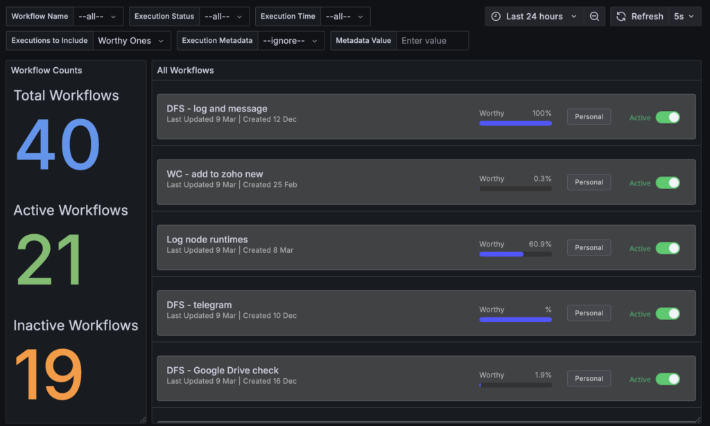
NOTE: I tried to replicate the UI from n8n as best as I could. Surprisingly, you can’t change the background colour of panels in Grafana. Ah well.
Starting on the left, I display total workflows (40 in my case), active workflows (21), and inactive workflows (19).
Enable / Disable Workflows – just like in n8n
Grafana is really a data visualisation platform and it doesn’t really encourage, nor support users modifying data. But I’ve set up the Active toggle image to call a URL which is actually an n8n webhook URL to toggle the workflow between enabled and disabled. The problem? Grafana won’t open the link in a new tab / window.
But I’ve added something more interesting: the “Worthy %” metric.
This metric shows what percentage of executions actually processed data versus just checking for new data. Why is this important? Let’s say you’ve set up a workflow to process a batch of records. While it’s running, you’ll see a high percentage of “worthy” executions. When that percentage starts dropping toward zero, you know your batch process is complete – the workflow is still running every few seconds, but it’s not finding any new data to process. This can help you identify when to disable workflows or investigate data sources.
Setting Up “Worthy” Execution Tracking
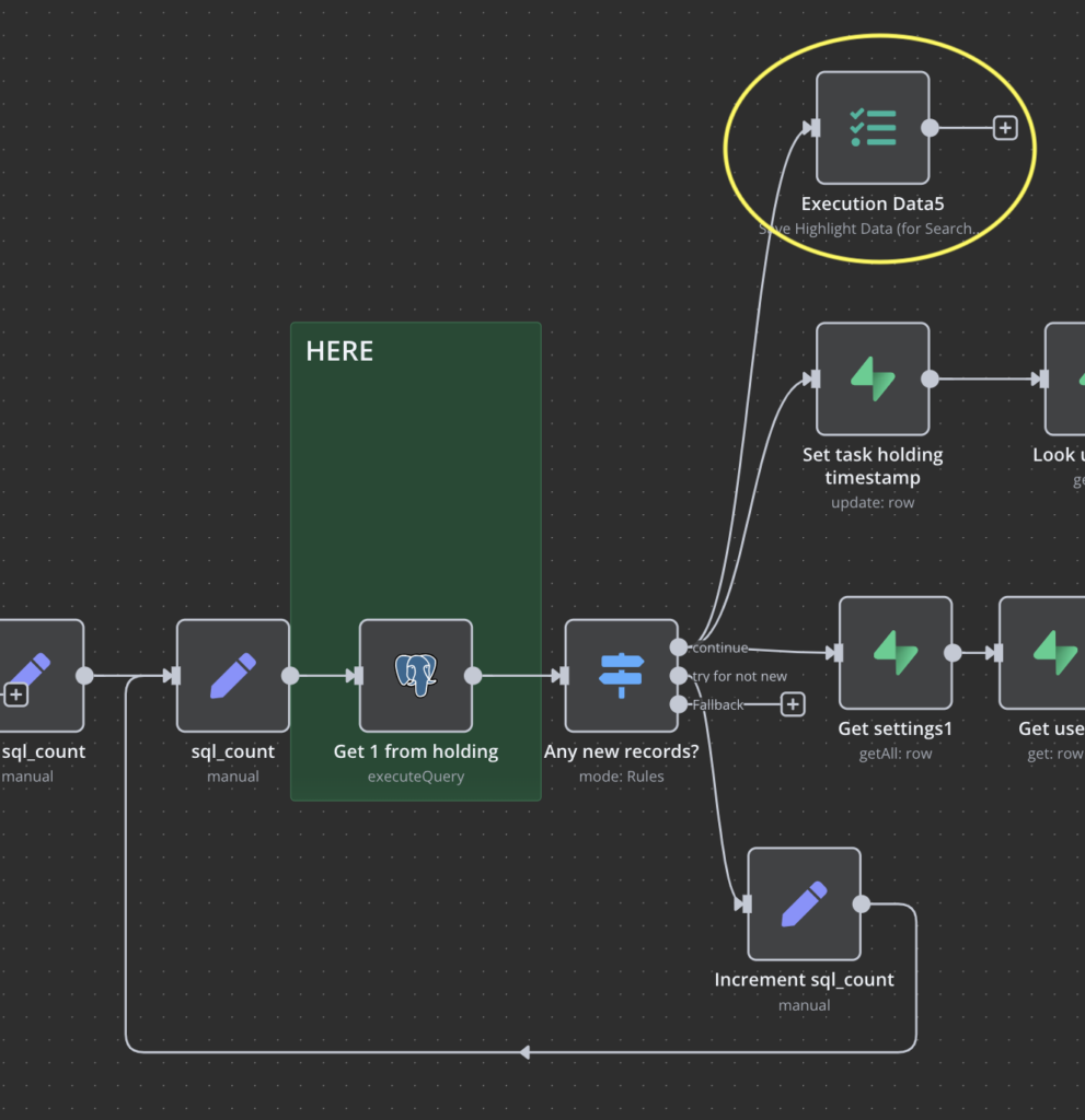
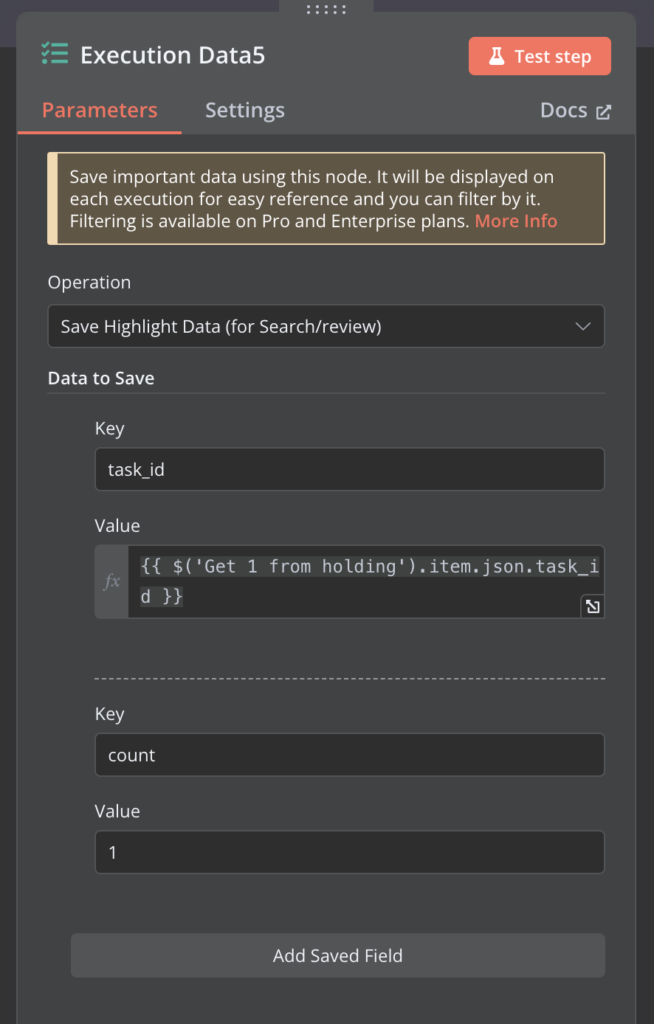
To enable the “Worthy %” metric in Grafana, you need to add an execution data node in your N8n workflows. This node sets a key-value pair of “count = 1” whenever the workflow performs meaningful work. For example:
- After successfully processing new records
- When changes are detected and acted upon
- When user interactions are handled
Without this metadata, it’s impossible to distinguish between executions that actually processed data and those that just checked for updates. This simple addition becomes the foundation for understanding real workflow activity levels in your Grafana dashboard.
Enhanced Filtering
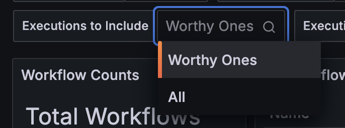
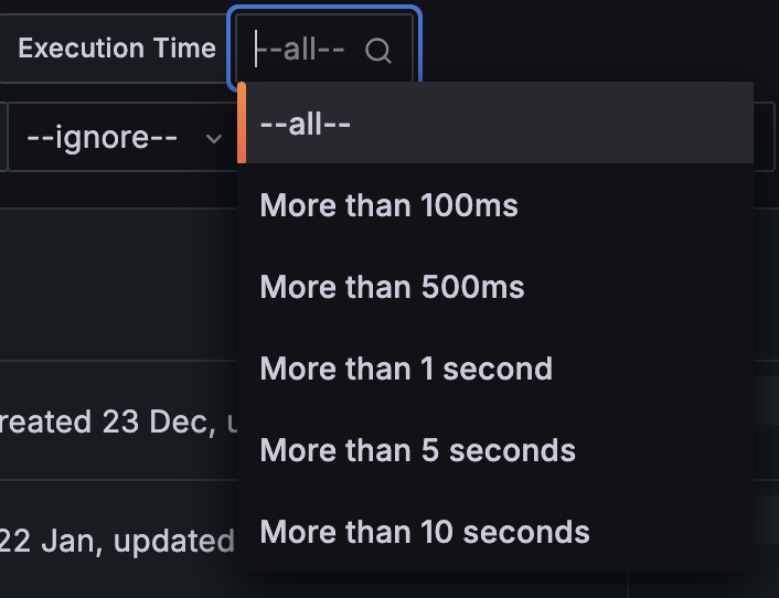
I’ve maintained N8n’s basic filtering capabilities (workflow name and execution status) but added several crucial additions:
- Execution time filtering (find those long-running processes)
- “Worthy executions” filtering (focus on meaningful runs)
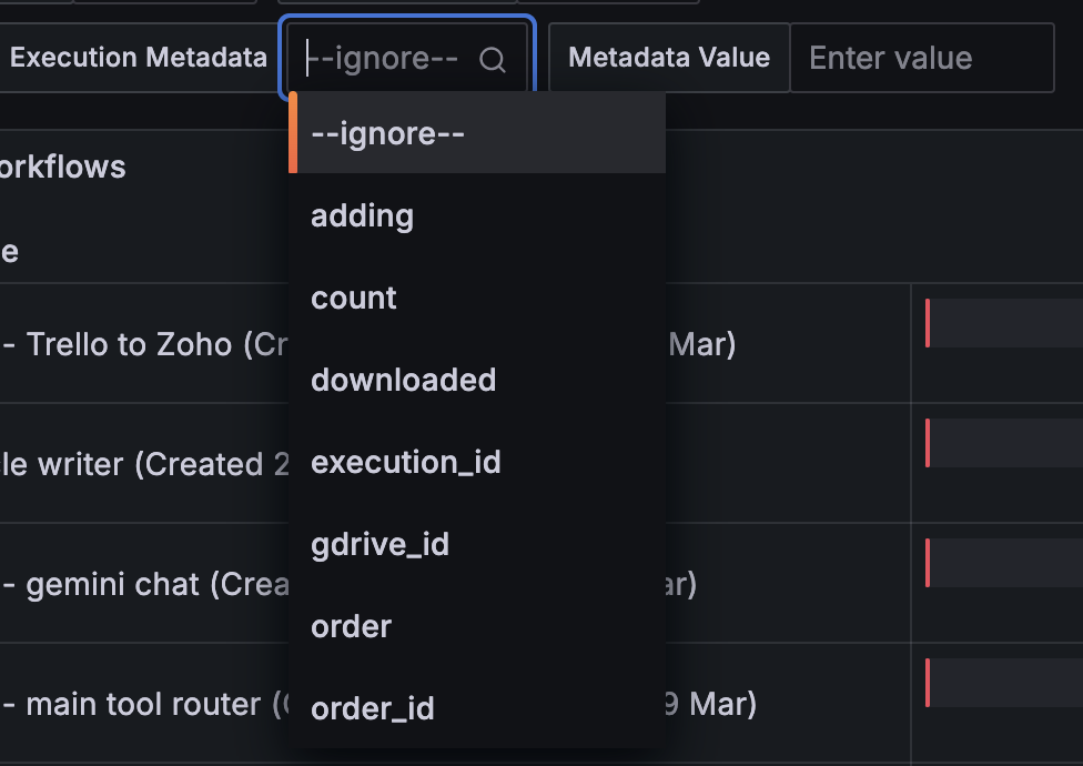
- Smart metadata filtering
That last point deserves elaboration. Instead of expecting users to remember every possible metadata key, the dashboard pre-populates the metadata dropdown based on your other filter selections. Select a specific workflow? You’ll see only the metadata keys used by that workflow. Looking at all workflows? You’ll see all available keys.
Grafana’s Time Control
A significant advantage of using Grafana is its sophisticated time filtering capabilities. Beyond our custom filters, Grafana provides:
- Quick presets (Last 5 minutes to Last 2 days)
- Precise time range selection with calendar picker
- Timezone management
- Relative time ranges
- Auto-refresh options
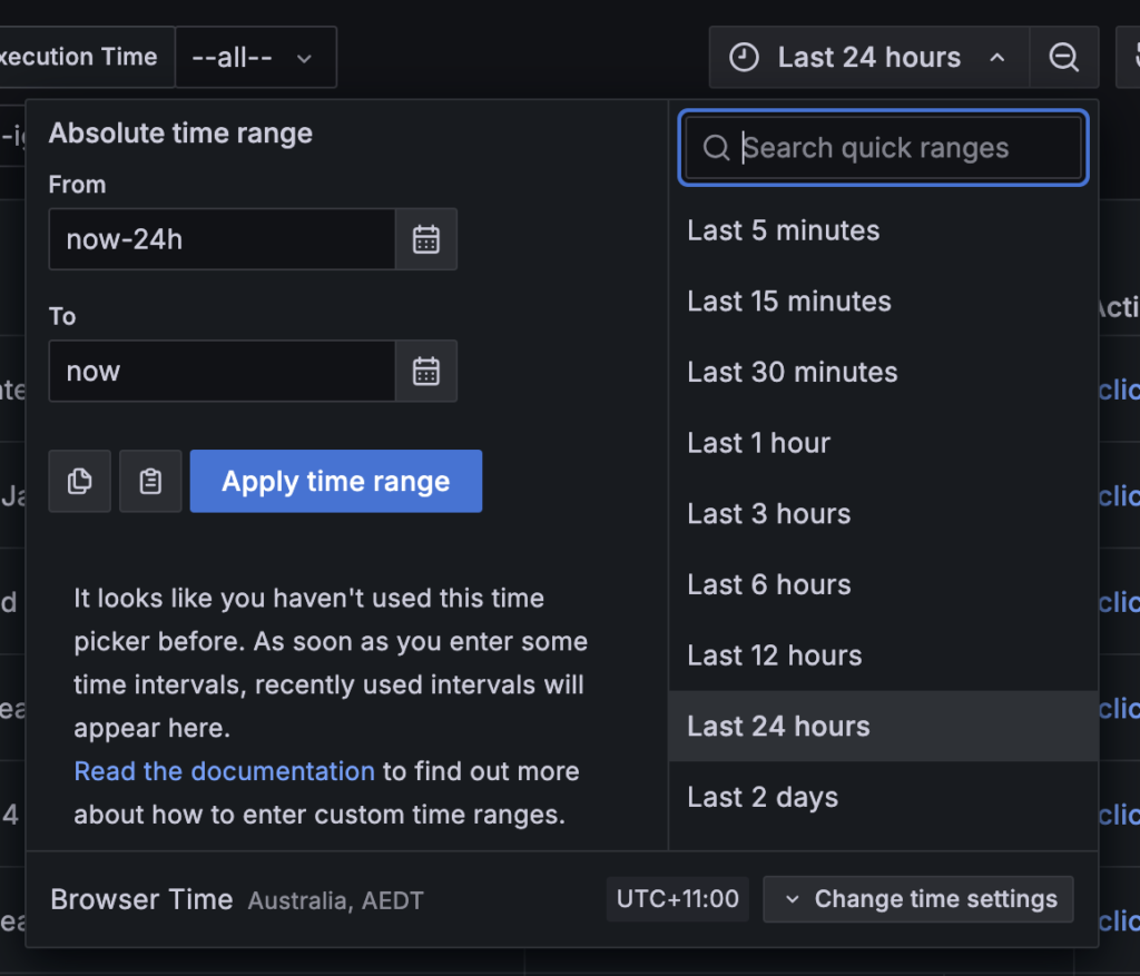
When combined with our custom filters (workflow name, execution status, metadata, etc.), this gives you incredibly granular control over your data visualization. You can analyze patterns across different time periods, compare time ranges, and zoom in on specific incidents.
Execution Monitoring
Current Execution Status
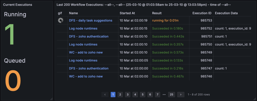
The dashboard provides immediate visibility into your execution state with two critical metrics on the left:
- Running executions (currently 1)
- Queued executions (currently 0)
This is particularly valuable for monitoring concurrency limits. With my limit set to 5, seeing the queue count increase indicates potential bottlenecks that might need attention.
Execution List
The main execution list provides more detail than N8n’s native interface:
- A GIF indicator for running executions (similar to N8n, but integrated with other metrics)
- Workflow name
- Start time
- Execution result with duration (e.g., “Succeeded in 0.328s”)
- Execution ID
- Execution Data (showing metadata set by your “Execution Data” nodes)
The execution data column is particularly important and something you don’t see in n8n’s interface – it shows the metadata attached the execution which can provide quick and easy insight into what the workflow was processing.
Error Analysis and Success Rates

Moving beyond simple execution listing, the dashboard provides crucial error metrics for each workflow:
- Total number of executions
- Success count
- Error count
- Crashed count (distinguished from regular errors)
- Success rate percentage
- Time-based error visualization
The distinction between errors and crashes is important. An error might be an expected condition (like no data found), while crashes indicate more serious issues needing immediate attention.
The time-based error chart on the right shows error patterns over time, helping identify if issues are isolated incidents or part of a larger pattern.
Workflow Execution Duration Analysis
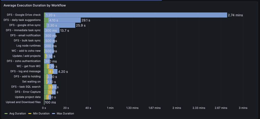
The execution duration panel provides a comprehensive view of how long each workflow takes to run, sorted from longest to shortest running workflows. For each workflow, we can see:
- Average duration (green)
- Minimum duration (yellow)
- Maximum duration (blue)
This visualization immediately highlights potential issues. For example, the “DFS – Google Drive check” workflow shows an interesting pattern: while its average execution time is just 1.20 seconds, it has a maximum execution time of 2.74 minutes. This significant disparity suggests an anomaly that needs investigation.
When you spot anomalies like this Google Drive check spike, you can use the workflow filters we discussed earlier to drill down into that specific workflow’s execution history and even examine individual node performance to identify the bottleneck.
Other workflows show more consistent patterns. For instance:
- “DFS – daily task suggestions” averages 4.10 seconds with a maximum of 29.1 seconds
- “DFS – google drive sync” typically runs for 2.30 seconds but can take up to 25.9 seconds
- Many utility workflows like “Log node runtimes” and “Upload and Download files” consistently execute in milliseconds
This view helps identify:
- Workflows that might need optimization
- Unexpected performance spikes
- Consistent vs inconsistent performers
- Resource-intensive workflows
The time scale along the bottom, ranging from 0 seconds to 3 minutes, gives clear context to these durations and makes it easy to spot outliers in your workflow performance patterns.
This leads us into the node-level performance analysis…
Node-Level Performance Analysis
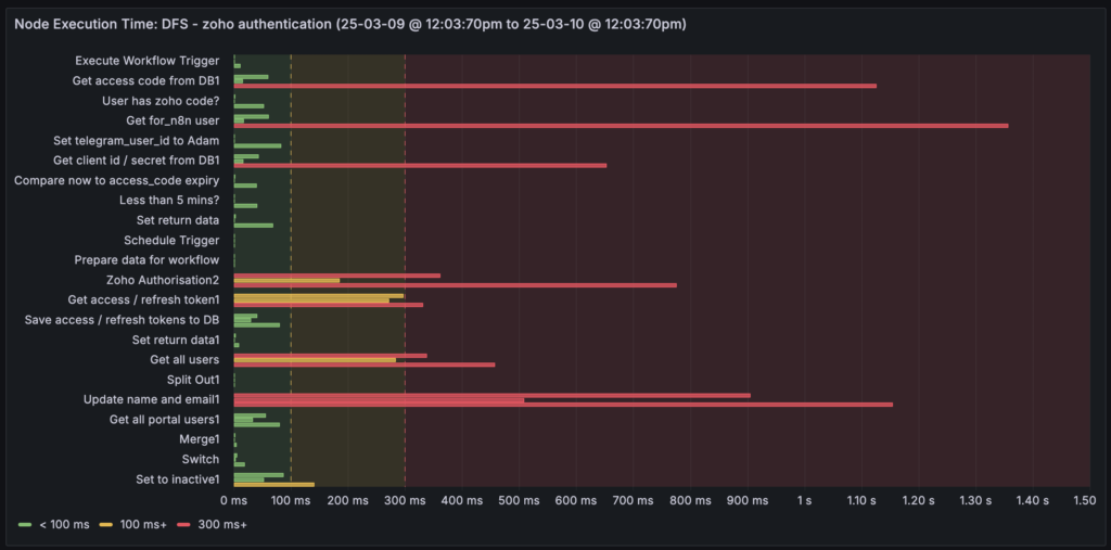
This is where things get interesting, and it required some deep diving into N8n’s database structure. I wanted to know which nodes in my workflows were taking the most time. This meant decompiling how N8n stores execution data in its Postgres database – following chains of references through JSON arrays to extract individual node execution times.
The result is a visualization showing each node in a workflow, color-coded by execution time:
- Green: < 100ms
- Yellow: 100ms+
- Red: 300ms+
This makes it immediately obvious where your bottlenecks are, something that’s impossible to see in N8n’s native interface.
Want more? Fine, let’s display that data matching (as best as I can within Grafana) n8n’s user interface:
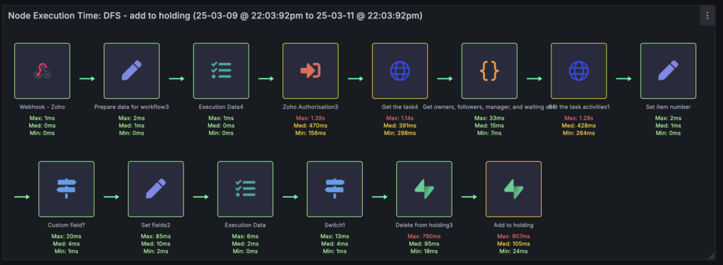
So there you have each node in this workflow, starting with the Webhook trigger, with the min/max/avg node execution times (across all executions for this workflow) shown under each node. I highlight the nodes green, yellow, or red based on the thresholds mentioned earlier.
Okay, I’m a little bit proud of that :p
(this was quite an effort – I had to extract the node “type” from the execution data. Then extract the HTML and parse the DOM of every workflow rendered in a browser in order to:
- find the node “type” for each node
- determine if the icon was an SVG icon, or a Font Awesome definition.
- If SVG, then I could look up the SVG file on their server and render it in Grafana
- If Font Awesome, get the FA reference and color, then look the color up in n8n’s CSS file
- Convert the color definition (often in RGB or HLS) to Hex
- And then battle with Grafana to get the visualisation similar to n8n !
Queue Management and Resource Monitoring
Understanding Queue Behavior
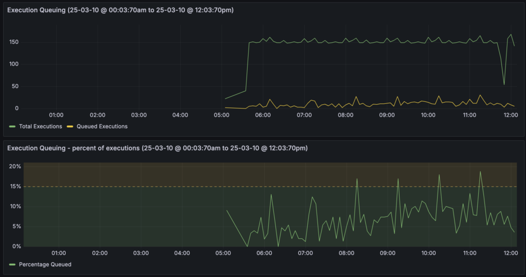

Queuing becomes critical as you scale. You need to set N8n’s concurrency limits low enough to prevent resource exhaustion, but high enough to prevent excessive queuing. I’ve set mine to 5, which might seem low, but here’s where the data becomes valuable.
I’ve created three complementary queue visualizations:
- Raw Numbers: The top chart shows total executions versus queued executions. In my case, I typically see around 10 executions in the queue at any time.
- Queue Percentage: This takes the raw numbers and shows them as a percentage, with a threshold set at 15%. I’m consistently under this threshold, which initially might sound concerning – 10% of my workflows are queuing? But this leads us to…
- Queue Duration: This is where context becomes crucial. While yes, about 10% of executions queue, they’re typically only queued for less than a second, with occasional spikes to 6-7 seconds.
This three-panel view helps make informed decisions. For my use case, where most workflows are doing batch processing or scheduled syncs, a brief queue time is acceptable. If a workflow is syncing data once a day, waiting 20 seconds in a queue isn’t critical. However, if you’re handling user interactions with AI agents or other real-time processes, you might need to adjust your concurrency limits based on this data.
Resource Monitoring

This section uses Prometheus metrics exposed through N8n’s /metrics endpoint. An important clarification: these aren’t server-level metrics – they’re specific to N8n’s Node.js process. This distinction is crucial for monitoring memory leaks and application-specific performance issues.
Looking at my own data, there’s an interesting pattern of increasing RAM usage followed by sudden drops. This could indicate a memory leak that needs investigation. This kind of insight is impossible with N8n’s native interface.
Why Prometheus? It’s about efficient data storage and retrieval. Prometheus logs data at intervals (say, every 15 seconds) rather than storing every fluctuation. This reduces database load and storage requirements while maintaining meaningful metrics for dashboard visualization. While I could potentially replace some of my direct database queries with Prometheus metrics over time, having both provides valuable cross-validation of the data.
Webhook Security Monitoring

I’ve separated webhook executions into their own panel for a specific reason: webhooks are your exposure to the outside world. They’re potential security vulnerabilities that need special attention. When you see unusual patterns in webhook executions – perhaps too many calls or calls at unexpected times – it could indicate spam bots or security probing attempts.
The panel shows:
- Workflow name
- Webhook path
- HTTP method
- Node name
- Execution time
This makes it easy to spot unusual patterns that might need investigation.
Custom Logging and Business Process Monitoring
Beyond System Logs
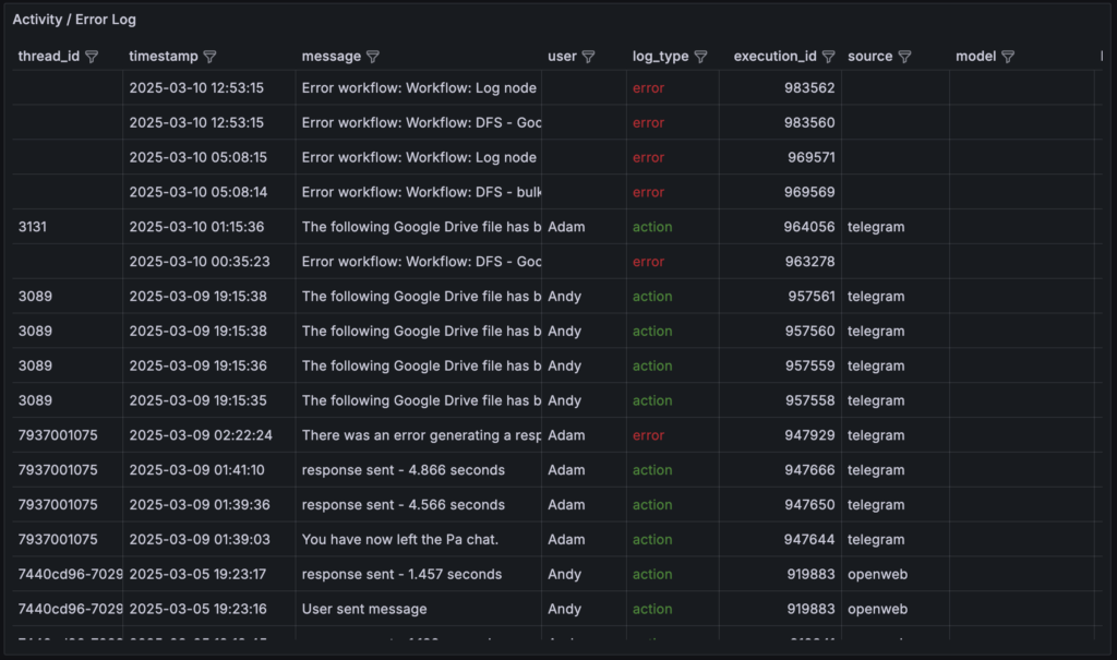
While N8n’s database captures system-level errors, I needed something more comprehensive. I implemented a combined logging and messaging system through Supabase that captures both technical and business process information.
The key insight here is that monitoring isn’t just about bits and bytes – it’s about understanding your entire operation, including human interactions and business processes. This system captures:
- User interactions
- Process completions
- Business logic validations
- Input sources (OpenWeb, Telegram, MS Teams, etc.)
- Custom error conditions
Every workflow points to a catch error workflow, which in turn calls a log and message workflow. This dual-purpose system can:
- Log events without messaging
- Message users about issues
- Message admins
- Do both logging and messaging
- Capture unhandled exceptions
Why combine logging and messaging? They’re fundamentally related – both are about recording and communicating what’s happening in your system. The difference is merely whether that stored “communication” is additionally sent off to the user via their preferred method.
Future Possibilities and Planned Improvements
Immediate Enhancements
- Emergency Stop Button
- Currently can disable individual workflows, but need a “stop all” capability for emergencies
- Bulk deletion of pending executions
- Resource Monitoring Expansion
- Add server-level metrics alongside N8n metrics
- Implement predictive scaling alerts
- Track API rate limits across services
- Integration Possibilities
- Google Analytics metrics
- CRM data correlation
- Workflow dependency visualization
- Backup/disaster recovery monitoring
The Bigger Picture
This dashboard is really just the beginning of what could become a comprehensive business command center. The principles here could extend to:
- Employee/contractor activity monitoring
- Process efficiency metrics
- Customer interaction patterns
- Resource utilization across services
Implementation Notes
Everything runs in Docker containers:
- Grafana
- N8n
- Prometheus
- Supporting services
The setup connects directly to N8n’s Postgres database, which required understanding:
- N8n’s database schema
- Complex JSON storage patterns
- Execution data relationships
- Performance implications of queries
A technical deep-dive into these aspects will be covered in a follow-up post.
Final Thoughts
This isn’t about fixing specific problems – it’s about having the data you need to make informed decisions. Whether you’re planning capacity upgrades, optimizing workflows, or monitoring business processes, you need comprehensive visibility into your operations.
The native N8n interface serves its purpose for basic workflow management, but as your automation infrastructure grows, you need more sophisticated monitoring tools. This Grafana dashboard provides that visibility while remaining flexible enough to evolve with your needs.
Remember: you can’t make data-driven decisions without the data. Start collecting it before you need it.
Questions? Interested in implementing something similar? Leave a comment or get in touch. And watch for the technical implementation post coming soon.


22 Comments